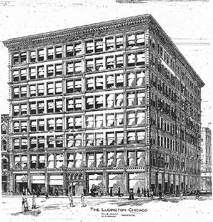
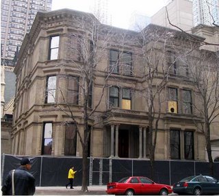
Chicago's 1883 Nickerson Mansion continues its path to rehab. Designed by the firm of Burling and Whitehouse for liquor baron Samuel M. Nickerson, it spent the greater part of the last decade as the home of R.H. Love Galleries. Later, it was acquired by Chicago investment banker, philanthropist and classical architecture enthusiast Richard Driehaus, whose firm is housed in the beautifully restored, pink-Kasota-stoned Ransom Cable house, designed by Cobb and Frost in 1886, just across the street. The Nickerson is being restored and its opulent interiors retrofitted to serve as a museum for Driehaus's extensive art collection. It is one of the last survivors of the grand mansions that were rife in what developers have now rebranded as the "Cathedral District."
The Nickerson's immediate environs is a mini-theme part of classically themed architecture. To the southwest is the aforementioned Cable House. To its north is the Victorian Episcopal Cathedral of St. James, built first by Burling in 1857 and rebuilt, after a fire, 1875, when Burling's partner was the pre-Sullivan Dankmar, Adler. To its west is the massively scaled Roman-styled John B. Murphy Memorial Auditorium, designed by flapper-era classicists Marshall and Fox in the 1920's, shoe-horned into its compact mid-block site as if it were about to burst its seams.
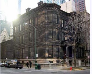
On one level, removing the decades of grime from the Nickerson's facades is like erasing the fingerprints of times past. Considering that the air of late 19th century Chicago was dripping with smoke and coal dust, it's likely that the Nickerson's sandstone exterior carried that rich patina or urban dirt for all but a small fragment of its history. Its current, freshly scrubbed state is a bit of a shock - like the skin of a baby who looks less pink than raw. Still, cleaning it up helps you be able to stand in front of the great house and imagine what it was like to experience it newly minted.
A daily blog on architecture in Chicago, and other topics cultural, political and mineral.
Click on the COMMENTS link under each post to join the discussion.
Friday, March 31, 2006
Thursday, March 30, 2006
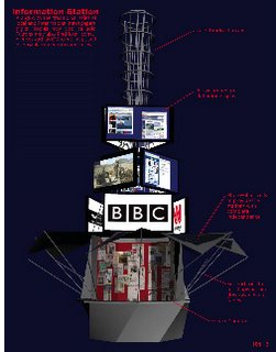
Sidewalk Superintendants Delight - Curtain Wall Goes Up at MBC
Is there anything more lazily satisfied than watching others do interesting work? River North architecture buffs had a grand show put before them as the curtain wall for Chicago's new Museum of Broadcast Communications was assembled over this past Saturday and Sunday. One by one, nine twenty-seven-foot-high, 2,000 pound panels were gingerly lifted . . . read the full story and see the pictures here.
Wednesday, March 29, 2006
Winning newStand competition winners now on view at AFHChicago website
Architecture for Humanity Chicago has unveiled on its website the winners of its recent newSTAND competition to design a new urban news stand for today's new media age.
An earlier ArchitectureChicago Plus post had referred to the way the announcement did not display any of the winners, but only suggested they would be on display at a $75.00 a ticket fundraiser on April 21st.
In comments responding to the post, Civic Blueprint, which is sponsoring the fundraiser, stated that all profits from the event will go to AFH's national organization and that "We are pleased to be able to exhibit the winning entries at re:FAB but we believe that AFH Chicago has a responsibility to showcase the entries on their website as well." A second post from AFH Chicago states "It has never been the intention of AFH Chicago or Civic Blueprint to use the fundraising event as an opportunity to gain money by providing this as the only opportunity to view the submissions. The winners will be posted on the website by the end of the day." Which, indeed, they are, with larger versions of the images promised in the near future.
For own part, our initial comments were not about casting any aspersions as to where money was flowing, but a criticism of how announcing winners without publishing images as well as leaving the impression that they will only be able to seen at a paid fundraiser is not a good way to promote exceptional architecture, and we're very glad to see those images are now becoming publicly accessible. You can read the original post here, the full responses here, and see the images here.
Thursday, March 23, 2006
A Restaurant Goes Dark. A Street Goes Dead
For over a century, the Berghoff, Chicago's oldest restaurant anchored Adams street in the heart of the Loop. It's post-fire, 1870's buildings outlived all its neighbors, seeing William LeBaron Jenney's Fair Department Store replaced by an Destefano/Bofill office block, and Burnham and Root landmarks supplanted by Mies van Der Rohe's Federal Center. Through it all, the Berghoff endured, through Prohibition, through the Depression, through the transformation of the Loop from one of the world's most vital commercial centers to an also-ran to the glitz of North Michigan Avenue. And just as the Loop has start to come back, with more and more of its vintage buildings converted to residential, the Berghoff family decided to pack it all in.
At least one of their black-jacket, white-shirted waiters, most of whom who had been at the restaurant for decades, saw it coming. I remember having lunch at the Berghoff not that long ago and overhearing him bemoaning to a diner at a nearby table how management was becoming increasingly remote from day-to-day operations. "I give it about a year," I remember him saying. He wound being a pretty good prophet. I should have seen the handwriting on the wall that day, as well, when my classic German pot roast with mashed potatoes and creamed spinach came to my table adulterated by a "julienne of vegetables."
While thousands mourned the loss of the Berghoff - and stood in long lines to get in for one last meal before the final closing on February 28th - others shed no tears. Mayor Daley talked about the inevitably of change. Other's said they didn't like the waiters' attitude, the food had long since grown tired and ordinary; it was overpriced tourist trap.
To me, however, it was a marvelous place. The food may not have been spectacular or cutting edge, but it never disappointed. And the place was real. Not a Disneyfied, sanitized, lobotomized recreation of an idealized past reimagined cookie-cutter style for fast-track franchising, but the real thing, lovingly passed down from generation to generation: the stained glass windows, simple wooden chairs and tables, the murals of the 1893 Chicago's Columbian Exposition banding the walls of the main dining room. It was unique, and its closing shut us off forever from a part of our history that will now only be accessible in books and fading photographs and memories.
On Adams, the effect is chilling. The Berghoff's tall sign was the street's key signature, and the inviting glow from the lights of the restaurant spilled out to warm the sidewalks and domesticate the often harsh, unsettled streetscape.
Ultimately, buildings - even the great ones - are only as good as the sense of life they nurture within. Even unexceptional structures - such as those of Berghoff - can often do this especially well. Now, with just a flick of a switch, a warm familial presence has turned cold and lifeless as a corpse. Adams street looks abandoned, depopulated, almost ghostly. Don't let them kid you: it's a major tear in Chicago's urban fabric.
Wednesday, March 22, 2006
Tuesday, March 21, 2006
$75.00 to see newSTAND competition winners?
Architecture for Humanity Chicago has announced the finalists for its newStand competition, intended, according to the competition brief, to address "the daily interaction between reader and news vendor" as part of the dynamic of a healthy urban streetscape. It directs that competition entrants address "a) the decline of print media; b) the positive effects of community business; and c) small scale architectural impact on the streetscape." The jury included Patricia Saldana Natke of Urban Works, Ltd., Henry L. English of the Black United Fund of Illinois, and architect Brad Lynch of Brininstool & Lynch.
But although the list of names appears on their website, Architecture for Humanity Chicago is not making it easy to view the designs, themselves. The email announcement included only the generic image to the left; no other images were attached. There are also no other images on the organization's website, which states only that "A sampling of all entries will be exhibited at an upcoming AFH event on April 21st at Salvage One in Chicago." Tickets for that event, hosted by Civic Blueprint, are $75.00 in advance, and are not available to those under 21, thereby locking out most students both by age and by cost.
Since this is AfHChicago's first competition, maybe we should cut them some slack, but the way they've handled it is sorely wanting. By inferring that the only way to see the entries is to cough up nearly a hundred bucks per person makes newStand appear to be less about promoting superior architecture than serving as a sideshow in a fundraising campaign.
Monday, March 20, 2006
America doesn't mount the world's tallest buildings much anymore - is it a sign of the sapping of our precious bodily fluids?
As American's weath flows to China, India and the Middle East via enormous trade deficits that leave ever increasing amounts of U.S. investment and debt in foreign hands, can the ebbing of American power and prestige be far behind? For better or worse, in this monetarized, post industrial age, the skyscraper has replaced the factory as the more potent symbol of national clout, and in the race to top, the United States is finding it harder to get it up. Read all about it - including which new landmark is Hollywood's latest phallic best supporting player - and see the pictures (no, not those kind of pictures) here.
Friday, March 17, 2006
An Emerald Carpet for Mies and Wrigley
Every year since 1962, dyeing the Chicago River green has been a local St. Patrick's day ritual. Nowadays, both the dyeing and a big parade take place the Saturday before the 17th. (Next year, they'll coincide when the 17th falls on a Saturday.) It's a uniquely Chicago tradition that tips its hat to the central role the Irish have played in the city's history. The actual dye is orange. It turns green as it's churned into the water.
For a few hours every year, the architectural landmarks that line the Chicago River acquire an aquatic front yard that's as vibrant as the neon green relish of a genuine Chicago hot dog. Read all about it and see all the pictures here.
Thursday, March 16, 2006
Block 37 - The Curse Lives!
Block 37 is a prime parcel of land in downtown Chicago between Marshall Field's (soon to be Macy's) and Daley Plaza with its Picasso statue. It is infamous for having all but one of its building (a Commonwealth Edison substation) bulldozed to dust in 1989 and then remaining resolutely empty ever since, passing through the hands of several developers, as well as architects including Helmut Jahn and Solomon Cordwell Buenz.
Last November, it looked like the corner had been turned when the Mills Corporation staged a lavish party for the groundbreaking for the latest iteration of the project, which includes an office building designed by Ralph Johnson of Perkins+Will, a large retail mall along State Street designed by Gensler Chicago, and a street level studio along Dearborn for WBBM-TV designed by Jim Prendergast of Goettsch Partners. Shortly after, Mills Corporation's finances began unraveling faster than a cheap sweater, with financial regularities unveiled, key executives sent packing overnight, its German partner bailing, and Mills, itself, rushing to sell off its stake in the project.
Now, to add insult to injury, Crain's Chicago Business reports that project subcontractors have effectively shut down all work on the site as they attempt to force Mills to pay them in advance for their work. Also today, the Wall Street Journal has a story on an even more ambitious future project, a $500,000,000 shopping and entertainment megacomplex in New Jersey's Meadowlands, is now in jeopardy as Mills has hired investment bankers to shop itself around to potential buyers.
Last November's Block 37 groundbreaking included a performance by a magician and his quick-change artist partner. Maybe Mills should hire them back as consultants - their skills may be exactly Mills needs to get Block 37 back on track.
Wednesday, March 15, 2006
Tuesday, March 14, 2006
The future of WTTW in just one word: Exfoliation
Just when you think Chicago PBS outlet WTTW's shameless corruption can't get any worse, they manage to sink even lower. As it has for every day for the last week, Chicago Tonight was thrown off the air after half an hour Tuesday night in favor of "special pledge programming", which on this particular evening means Dr. Denese, on loan from QVC, lecturing on "Ageless Skin" and hawking her videos, exfoliating pads, creams and serums as premiums for high-end viewer contributions.
I'm not making this up. What's next? A seminar on erectile dysfunction with creepy smiling Bob from the Enzyte commercials in studio for the pledge breaks? Increasingly for WTTW, programming is little more than the filler between the commercials and the fundraising. Why not sell it all off to Barry Diller and be done with it?
Beethoven's Seventh - the Greatest Symphony?
Trying to pick one "greatest" of all symphonies reminds me of the chronically argumentative parents in Woody Allen's film Radio Days, where the father bursts into the living room and confronts his wife, "Wait a minute! Are you telling me you think the Atlantic is a greater ocean than the Pacific?! "
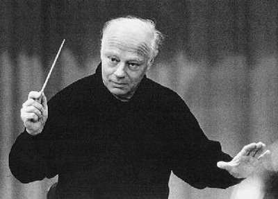
Be that as it may, the Chicago Symphony Orchestra performance conducted by Bernard Haitink last week reminded me once again why I believe the Seventh may have no equal. To some degree, it's a sentimental choice. It was a performance of the infinitely beautiful Allegretto in a performance by George Szell and the Cleveland Orchestra that first turned me on to the power of classical music over three decades ago. (I purchased the record from a bargain bin at the old Rose records as a "cutout", marked as a discontinued, price-t0-clear title by a small round hole punched through the upper corner of the cardboard sleeve.)
All of the Beethoven's other great symphonies are mired with extra-musical associations, beginning with Eroica, with its dedication to Napoleon that the composer tore up after Bonaparte embraced tyranny. The Pastoral, with its bird calls and lightning strikes - what else needs to be said? The 9th, of course, is where Beethoven hedged his expressive bets by overlaying Schiller's hymn to brotherhood over the music of the last movement. And no one can forget how the militaristic Fifth was appropriated as an anthem of victory by both the Allies and Nazis during World War II.
Despite Wagner's description of it as "The apotheois of dance", and Thomas Beecham's likening the scherzo to "a bunch of yaks jumping about," the Seventh has escaped being compromised by nonmusical associations. It resists any tone poem-like narrative. It simply is.
The masterful Haitink/CSO performance made this crystal clear, especially in the Allegretto. In most performances it takes on a mournful, death-march quality. Under Haitink's baton, it moved briskly, as it should, stripped of sentimentality, its profound sad beauty not worn on the sleeve but flowing organically from its innermost structure. And that momentum carried through all the way to the propulsive final Allegro Con Brio, where in the concluding bars the music seemed to lock into our own bodily rhythms - pulse, breathing, brain waves - and, for a few ectastic moments, the floor dropped from beneath our feet and we were transported to a state of pure energy. No subtitles required.
Monday, March 13, 2006
Goose Droppings in Grant Park and a Calendar Correction: LPCI Historic Columbia College lecture this Thursday
The idea of massive piles of droppings from the expanding populations of non-migratory geese that are making Grant Park their home sounds pretty funny until you're the one inadvertantly stepping into them. It's a topic being taken on by the Grant Park Advisory Council at a meeting at Daley Bicentennial Plaza Monday night. Also, a correction: Anne McGuire's LPCI Preservation Snapshot lecture on the preservation of the historic buildings that have been incorporated into the Columbia College campus is this Thursday, at 12:15 at the Cultural Center.
Also up this week, Snøhetta's Craig Dykers lectures at the CAF Thursday at 6:00 as does Sam Marts, on Timber Framing in Chicago, at 12:15 Wednesday. There's a reception and book signing for Perkin+Will's David Hansen's recently published Architect: Reshaping Corporate Culture at the Prairie Avenue Bookshop at 6:00 at Wednesday, and at Thursday's Chicago Plan Commission meeting, 42nd Ward Alderman Burton Natarus will be seeking to push through an amendment to the city's Planned Development ordinance to erase restrictions standing in the way of Santiago Calatrava's proposed 124-story Fordham Spire. Read about all these week's events on the March architectural calendar.
Sunday, March 12, 2006
A Different Take on Density in Tijuana and San Diego - Ouroussoff on Teddy Cruz
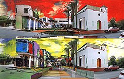
This Sunday's New York Times includes an excellent piece by architecture critic Nicolai Ouroussoff, that discusses the distinctive work of architect Teddy Cruz, of estudio Teddy Cruz. Like Orson Welle's Touch of Evil, it's a lot about crossing borders, in Cruz's case, in discovering connections between San Diego to the north and Tijuana, separated by a ten foot-high steel wall, to the south. Ouroussoff relates how Cruz has found an alternative to the affluent gated suburbs in California in a radically different concept of urbanism in Tijuana that draws on local traditions and supports the working poor.
I first came across Cruz's work in Out of The Box: Design Innovations in Manufactured Housing, an exhibition that ran at the Field Museum last year. While some critics almost disdainly considered Cruz's entry, Manufactured Site, out of place among others that attempted to rebrand manufactured housing as designer pre-fab, I thought Cruz's work really got to the point. Despite the often splendidly inventive concepts of the other architects in the Field's exhibition, making pre-fab more than a niche product among the affluent seems a long-shot battle - the predominant aspiration still seems to be as large a house on as broad a plot as the mortgage holder will allow, built preferably on virgin farmland far away from toxic center-city cores.
Cruz takes on, instead, the central problem of housing the burgeoning populations of immigrant and working poor. We've seen how not to do this in the dreary high-rises of suburban Paris that became stagesets for recent riots. Rather than imposing what's best for them on populations without the economic clout to resist, Cruz draws on the methods that locals use to survive and creates an alternative that offers the choice and variety that bureaucracies seldom think the poor deserve.
As I said last March:
Cruz describes San Diego as "the Home Depot of Tijuana," from which discarded materials such as wooden pallets, garage and refrigerator doors, tarps, plywood - even entire houses slated for demolition - make their way across the border to be re-assembled into housing for the poor. Inspired by "the resourcefulness of poverty," Cruz's concept is a third-world revival of the Sears catalog house. Families would receive a kit with an assembly manual, a snap-in water tank, and 36 frames that can be placed in a variety of configurations, serve as frames for concrete poured on site, or to incorporate materials found nearby. Cruz would pair San Diego non-profits with local Mexican government officials to funnel money to the “maquiladora industry” - corporations that have built plants in Mexico to take advantage of a labor force characterized by low wages, no health care, and no unions - which would fabricate and distribute the kits, “to give back to the communities it exploits.”The New York Times article includes a generous complement of photographs and renderings and should be up for free for at least the next week. (registration required.)
Thursday, March 09, 2006
Historic Chicago Vista Trumped Out
Things change. The mostly unlamented modernistic Sun-Times Building is now long gone, along with its secluded oasis garden, and the 1,362-foot-high Trump Tower is now rising on the site. The new building, a sleek steel-and-glass edifice from SOM's Adrian Smith, has its own charms, and will be a ready-made landmark on the Chicago skyline when it's completed in 2008.
But with change, however, things get broken, and the rise of the new tower brings the loss of one of Chicago's great urban vistas: the view down Wabash Avenue to the the high, colonnaded dome of Thielbar and Fugard's 1927 neo-classical Jewelers Building. It's probably as close as we're ever going to get to the view down Congress, towards an almost distressing phallic new City Hall at Halsted, as proposed by Daniel Burnham's 1909 Plan of Chicago and illustrated in a series of famous renderings by Jules Guerin.
Because of the way Wabash makes a diagonal shift to the west just before it hits the river, the site of Trump's new building actually crosses the street's path, and you can already see in the tall crane and low stumps of the first pours of the concrete columns exactly how the structure will completely obliterate the view of the Jewelers Building and subsume it's role as Wabash's visual terminus. Not necessarily bad, but certainly a very different character. Take a final look at the current view while you still have the chance.
Tuesday, March 07, 2006
Koolhaas from Bangkok to Louisville - Never Throw Anything Away
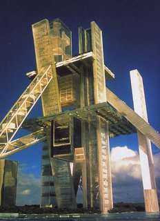
Thumbing through Rem Koolhaas's 2004 compilation Content, I came across a section I had forgotten: "The Hyperbuilding - OMA's brief, titillating brush with sci-fi." a proposal for Bangkok, Thailand - "a city on the edge of the tolerable (which) offers the perfect context in which to test these theories." The theories are for a "self-contained city", a 1,000-meter-high "mass of thin towers and blocks of program."
Bangkok, Thailand (left) Louisville, Ky (right)
The idea went nowhere, but Koolhaas and his collaborator Joshua Prince-Ramus are nothing if not persistent. Once they develop a theory, they kept refining it, often through several unsuccessful competitions or pitches, until they finally find a willing client. Who would have thought the client for OMA's wildly radical hyperbuilding would be found not in Tokyo, New York or China, but along the banks of the Ohio River, in Louisville, in the recently announced Museum Plaza project. It's not unlike how OMA's Seattle Public Library is a direct extension of their thinking for losing entries in competitions for a library in Jussieu and for the National Library in Paris, where the concept of floating programmatic elements within a large rectangular void can also be seen in simplied form in the Wyly Theatre project in Dallas, where programs are stacked vertically in an 11-story-high glass cube.
Bangkok, Thailand (left) Louisville, Ky (right)
Searching for Embarrassing Architecture and Lagos: World City of the Future?
I've just been looking over the Prairie Avenue Bookshop's February email of new arrivals, and what caught my eye was not a book, but a DVD, Lagos Wide and Close: An Interactive Journey Into an Exploding City, a documentary by Bregtje van der Haak, who followed Rem Koolhaas around for two years as the architect worked on researching the urban condition of the Nigerian city of 14,000,000 that is adding 21 new residents every hour. Koolhaas sees Lagos as a prototype for his concept of a "culture of congestion", where the traffic jams are so pervasive and severe that impromptu trading markets break out amidst the stalled vehicles. This Harvard Design School Project on the City was discussed in Koolhaas's 2001 compilation Mutations, but has still to produce a final book, as projects on shopping on China did previously. Perhaps the type of rapid change Koolhaas and his team are trying to document can no longer be captured on a static, printed page, but only through full-motion video.
Prairie Avenue's list of new arrivals includes monographs on Shigeru Ban, Richard Neutra, Herzog and de Meuron, etc.,etc., but one book stands out solely on the basis of its title, Starving for Embarrassing Architecture. The book combines photos of "vernacular architecture" in L.A. with interviews that quiz residents about what they see as "ideal and utopian living and working spaces." The author sees "'embarrassing architecture' as a liberation from the formal and static rules of architecture." In Chicago, we could use a little more embarrassment as an alternative to the willfully characterless high-rises that are overtaking more and more of the center city.
The Prairie Avenue Bookshop, Chicago's - and perhaps the world's - largest architectural bookstore, will be sponsoring two book signings this month. The first, on Wednesday March 15th will feature David A. Hansen, Architect and his book Reshaping Corporate Culture. The second, Houses: The Architecture of Nagle Hartray Danker Kagan McKay Penney, will take place on Wednesday, March 29th. The Bookshop is located at 418 South Wabash, 800/474.2724
Prairie Avenue's list of new arrivals includes monographs on Shigeru Ban, Richard Neutra, Herzog and de Meuron, etc.,etc., but one book stands out solely on the basis of its title, Starving for Embarrassing Architecture. The book combines photos of "vernacular architecture" in L.A. with interviews that quiz residents about what they see as "ideal and utopian living and working spaces." The author sees "'embarrassing architecture' as a liberation from the formal and static rules of architecture." In Chicago, we could use a little more embarrassment as an alternative to the willfully characterless high-rises that are overtaking more and more of the center city.
The Prairie Avenue Bookshop, Chicago's - and perhaps the world's - largest architectural bookstore, will be sponsoring two book signings this month. The first, on Wednesday March 15th will feature David A. Hansen, Architect and his book Reshaping Corporate Culture. The second, Houses: The Architecture of Nagle Hartray Danker Kagan McKay Penney, will take place on Wednesday, March 29th. The Bookshop is located at 418 South Wabash, 800/474.2724
Monday, March 06, 2006
IIT's Robertson and Thirst/3ST's Valicenti honored
Donna Robertson, the Dean of the College of Architecture at IIT who has seen enrollment at her school explode and the campus's first new construction in almost four decades with striking new buildings by Helmut Jahn and Rem Koolhaas, was named last week a Fellow of the American Institute of Architects. She will receive a fellowship medal at ceremonies during the AIA's 2006 annual convention in L.A. this coming June. Fellows number less than 2,500 out the a total membership of nearly 78,000. Chicago architects also elevated to AIA Fellows this year include James Baird, Paul Florian, Holly Gerberding, Philip Hamp, Thomas Hoepf, Helen J. Kessler, Dennis Rupert, and Mark Sexton.
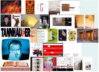
And speaking of IIT, the designer of the school's spring lecture poster, Rick Valicenti, of Thirst/3ST is one of three graphic designers winning the 2006's AIGA Medal, which will be awarded at the American Institute of Graphic Arts Design Legends Gala in New York this coming October. Valicenti was cited for "he passion and intelligence of his influential work, his inspiration to his colleagues and his mentorship to a generation of students." Valicenti's portfolio includes work Wired Magazine, for Lyric Opera, (including the poster for it's landmark 1989 Peter Sellars production of Wagner's Tannhauser that reset the work in the world of today's televangelists), for Smithfield Properties including the MOMO website, and a corporate identity campaign for 4240 Architecture.
Friday, March 03, 2006
God vs. Mammon on East Wacker
Harry Weese's 1968 Seventeenth Church of Christ, Scientist at 55 E. Wacker Drive is a perfect example of how it's often not the oldest architecture, but that closest to our time that's most in danger of destuction. It's not on the list of the Chicago Historic Resources Survey of important Chicago buildings, which doesn't anything built after 1940. The list was completed way back in 1995, and has yet to be updated, so that a masterwork like Bertrand Goldberg's Prentice Hospital remains completely unprotected. Northwestern Hospital and University have moved quickly to demolish old facilities like the neo-Gothic Wesley and Passavant Pavilions, and it's likely they've already signed Prentice's death warrant, and will dare anyone to stop them from carrying it out.
On February 17th, the Chicago Tribune reported that the developer who owns the 1928 Art Deco Chicago Motor Club tower has had problems redeveloping the property, and is looking to make the Church of Christ just around the corner part of a larger, more viable combined development parcel. According to reports, he's wooing church members to let me build over their church, or even demolish it.
Weese's church is far from perfect - the recessed, lower level garden tends to be little more than a dark moat, but Weese managed to use concrete to create a building that carries echoes of big-boned Gothic while being completely modern. The way its curving concrete facade turns the corner and its low exposed-ribbed, disc-topped dome counterpoints the angular skyscrapers all around it make Seventeenth Church of Christ one of the most graceful buildings on Wacker.
This Monday, March 6th, docomomo-midwest, the local chapter of the global organization dedicated to documenting and preserving modernism, is taking the bull by the horns by sponsoring a lecture by architectural historian Rolf Achilles. It's free for docomomo-midwest members, $8.00 for non-members. The lecture will begin in front of the curch at 55 E. Wacker, and continue in the offices of Perkins+Will in Mies van der Rohe's IBM Building, where you'll need a photo ID to enter.
You can make reservations via email.
Wednesday, March 01, 2006
What Becomes a Parking Garage Most?
There are two basic schools of thought regarding the design of parking garages. The first could be said to be the "honesty first" approach. Cars have minimal physical needs in terms of shelter, and no sense of aesthetics. The best garages, therefore, are like really big closets: we don't expect them to be beautiful - just an efficient place to store out stuff. In architecture, the homely, if frankly presented, can even gain our admiration. A good example would be Harry Weese's parking garage on South Federal, next to his striking Chicago Metropolitan Correctional Center, where he gives absolute minimalism his highly personal stamp. Bad examples, alas, abound, such as the huge and stupid garage behind 900 North Michigan, and the podium of just about any "plop architecture" condo tower you can name.
The second could be named the "silk purse" approach. A prime example would be Stanley Tigerman's witty self park on east Lake Street, but the variations are endless. At DeStefano+Partners' One South Dearborn, the cladding over the garage is lightened by a series of six-story high vertical glass louvers along Madison. Often, the ramp, itself, becomes the ornament countering the severity of the garage proper. Think of the spiral ramp at the John Hancock Building that provides a bravura counterpoint to the expressionless dead windows of the garage floors. At James Goettsch's 111 S. Wacker, the bottom of the ramp becomes a sculptural element in the ceiling of the lobby. At Ralph Johnson's Contemporaine, the exposed ramp becomes a stage set bit of urban theater.
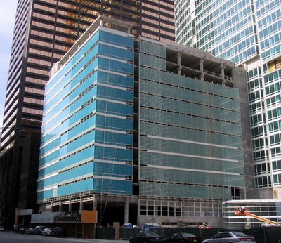
The garage for Solomon Cordwell Buenz's new condo tower, The Streeter,
on east Grand right next to another Harry Weese classic, the former Time-Life Building, may not be the same league, but it's a graceful solution. The structure is essentially a smaller bustle to the main building, and its' clad in two different tones of glass, tending toward turquoise along Grand, and a sea green along its eastern facade. Unlike the tower, where it's an insistently expressed grid of spandrels and mullions, the curtain wall on the garage reads as continous bands of glass along each floor, each topped out by white spandrel and/or short strip of clerestory windows. It provides a bright counterpoint to the warm Cor-Ten tones of its strong-boned neighbor to the west.