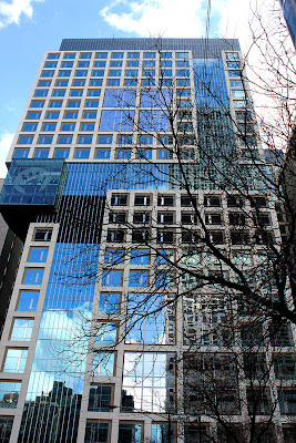
"The OCP is a campus building continuing the architectural tradition of Feinberg, Galter and Prentice . . . "Could they set the bar any lower?
This is the new Rush Presbyterian Hospital, designed by Perkins+Will, and the adjacent Midwest Orthopaedics building . . .
click images for larger view
This is the Zimmer Gunsul Frasca's new Ann & Robert H. Lurie Children's Hospital . . .. . . and this is Northwestern's new OCP . . .
Can anyone explain the logic of this design? Why, on the Erie and Fairbanks elevations shown above, the precast concrete piers or fins are rendered as being continuous, while on Ontario street . . .
the concrete piers start, and then stop, and then the curtain wall is all steel-and-glass, and then it stops, and then the piers start again, and then they stop again, and then its steel and glass again, and then it's a steel penthouse like the top of a cheap medicine bottle. And what's the deal with those metal louvers like hanging chads that cover over half the windows between the piers? If they're venting the parking garage, why are they on only some of the parking floors? Could there be any more graceless way to do this?
Could a design be any more jumbled and incoherent? If it were a patient, attention-deficit-disorder would be the easy diagnosis. I suppose you could try to pass it off as a kind of Mannerist Modern, but I'm not sure even that would wash.
As someone who was recently there for an outpatient procedure, I can attest that Northwestern's medical credentials are top drawer. It's now embarked on a campaign to establish itself as a world-class institution, on the level of the Cleveland and Mayo Clinics. So why does it insist on presenting itself through buildings whose profiles are relentlessly indifferent, so generic and forgettable?
And why is it so hell-bent on destroying the only truly distinctive work of architecture on its campus, Bertrand Goldberg's Prentice Hospital?


To place blame where blame is due, Northwestern University, not Northwestern Memorial Hospital, owns the original Prentice now and is responsible for its fate. Although NMH didn't help matters by leaving it half empty for four years. Should be an interesting few weeks for Prentice... the building is now completely vacant and NU is releasing a ten year strategic plan at the beginning of next month.
ReplyDeleteBack on topic, the new building's architecture doesn't surprise me in the least but it's definitely disappointing. As it is an office building, I didn't expect any of the innovation seen in the new Rush and Children's hospitals and I figured NMH would stick with the boring style of the past twenty years, but I was hoping that they'd be a bit more adventurous.
Those buildings are so similar to each other. I was hoping to find more architecture than these. But those photos are amazing.
ReplyDeleteI couldn't agree more with both Nick and Batagnas. The part of Streeterville where NMH has its campus is beginning to look more and more like the Eastern Bloc ...
ReplyDeleteAll of these comments are perceptive and correct. This hospital's architecture is simply grim, and they keep repeating it. This is all such a wasted opportunity for the hospital itself AND for the city of Chicago. Why such conservatism - can anyone from this hospital answer me? Why is dullness celebrated?
ReplyDelete