click images for larger view
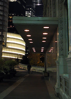
As we've written about before, the old plaza between the Wrigley Building and in its annex had grown increasingly derelict and forlorn, especially when seen against the sparkling new Trump Tower riverwalk.So a few weeks ago, they shut the thing down for what was described as facade repairs on the annex, which had already undergone a rehab a while back with red granite, metal frame windows, and a thick canopy in 60's/70's modern demarcating what was then the Wrigley Building restaurant.
The new rehab is now open, replacing the restaurant entrance with a series of storefronts with large windows, white metal frames, heavy framed doors, what looks to be large extruded light panels (although they weren't lit up last night) capped by rectangular vent panels above. The new designs are like an ugly scar against the elegance of the Wrigley's ornamented terra cotta, looking as if a 7-11 might move in at any minute.
The old fountain that had been boarded up for years, the desultory shrubbery - all gone, although you can still make out their footprints on the paving. The plaza has been completely emptied out. It's now just a wide expanse of walkway.
It's as if Wrigley's new owners, the Mars candy company, simply threw up their hands and decided to just make the plaza a kind of prelude to the spectacular, lushly landscaped Trump walkway to the west.
It's an acute disappointment, especially if it's a sign of how Mars's stewardship of one of the great jewels in Chicago architecture is going to play out. Still, if you aren't going to add anything worthwhile to the conversation, I suppose the next best thing is to just shut up and get out of the way. Cleaning out the clutter is an improvement. Before, all those shabby stuffings in the plaza were just an obstruction to the view towards one of the more spectacular walkways in Chicago, terminated by the Trump Tower and, in the distance, the handsome new 353 N. Clark, by Lohan Anderson.


Not much urban design in that scheme. Looks like a suburban shopping court.
ReplyDeleteWhat were they thinking? I though we learned from the idiotic storefront designs of the 60s (which pulverized many great buildings at ground level). What's wrong with the generous windows the Wrigley already has at eye level?
ReplyDelete