The Peshtigo's hammer head profile was an expression of its irregular floor plan, with Johnson replacing the standard glass box with what he described as a "bent bar", with multiple angles designed to provide minimal corridors and a maximized perimeter.
The view from the west was even bulkier . . .
It was to be called The Peshtigo because of the street on which it was to be built, block-long Peshtigo Court, home for decades to Mundie, Jensen's 1937 streamlined Kraft Cheese Company building. After the corporation fled to the suburbs, the structure was purchased by the Chicago Police Department, and in 2003 it was demolished.
Some have commented that Peshtigo was not exactly a good luck charm as a name. It's best known for the great fire of Peshtigo, Wisconsin, which occurred the same evening, October 8, 1871, as the far more famous Great Chicago Fire, but was vastly more deadly. Final estimates of the dead in Chicago ranged upwards to 300. The Great Peshtigo Fire, raging through the town largely built by former Chicago mayor William Ogden to service his vast lumber holdings, was estimated to have killed between 1,200 to 2,400.
In the final analysis, however, it wasn't bad kharma or irregular design that killed The Peshtigo, but a collapsing economy. It was intended to have 358 condominium units near the top of luxury pricing. The units were larger than usual, the smallest 882 square feet. But early on, there were snippings that those luxury prices came with generic quality finishes and appliances. And then came the crash.
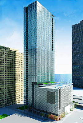
The Peshtigo is dead. Ralph Johnson is out; Solomon Cordwell Buenz is in. Courtesy of 42nd Ward alderman Brendan Reilly, who's holding a community meeting on the revised project at the Sheraton this Wednesday, we give you - 500 North Lake Shore Drive:
click images for larger view
. . . 120 feet shorter, a half million square feet smaller, with as many as 150 more units, as small as 600 square feet, cheaper price points, and at least 400 parking spaces in a bustle that looks like SCB spirited away the bottom of Brininstool & Lynch's 550 North St. Clair. So we're back to the elegant glass box, with Buenos Notches, a la Legacy, but no trademark SCB curved corner. Eminently reasonable. Very clean. Not overbearing - plays well with its neighbors. Has a little park. Several steps above everything around it.
So why am I feeling a pang of loss that we'll never be able to grow to love the brawny, lopsided pug?


I usually agree with you Lynn, but not this time. As a Streeterville resident who looks out over the very ugly Lakeshore East development--with its multitple podium garages-- I think the "new & improved" Peshtigo design is a major fail. Granted the original was not much better, but to go from a not-so-good design to a really bad design only heightens Streeterville's reputation as one ugly high-rise after the other-- with 'ever present barnacle-like podium garage parking. Frankly, Lakeshore East was a missed opportunity for a really forward looking modern crisp cohesive community design. They should have let Studio Gang do the whole Lakeshore development, instead of just Aqua. But, sadly, even she had to compromise with the as-built designs that detract from her original renderings. Bottom-line: Streeterville is fast becoming the 21st century equivolent of the Gold Coast's Sandberg Village, which is, architecturally speaking, ugly to look at today. IMHO, the new Peshtigo is ugly today and it will be even uglier tomorrow.
ReplyDeleteFrom an outsiders point of view, I don't like either. The first is awkward looking, the second is okay, pretty but boring and predictable. Not something you would imagine in an up and coming modern area. Looks like something from the 90's that was cool then.
ReplyDelete