 |
| click images for larger view |
 |
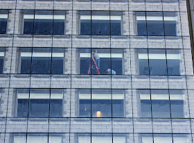
| 618 South Michigan, just this past June |
 |
| 618 South Michigan, 1950's curtail wall rehab |
That facade was replaced in the 1950's when IBM took over the building, with a tight grid of a glass and steel curtain wall that better fit in with it's tenant's ultra-modern branding.
 |
| 624 South Michigan Chicago Musical College, 1908, C.A. Eckstrom, architect |
Alschuler replaced the remarkably open and graceful first and second floor terra cotta facade with a less porous and far more ponderous stone cladding. Splices are seldom happy affairs, but Eckstrom's original, for all its fussy detail, actually seems a lot more amiable - and modern.
After 76,000 square-foot 618 was acquired by Columbia under the direction of former Chicago planning director Alica Berg, now Columbia's VP of Campus Environment, the 1950's curtain wall was found to be crumbling. Gensler was called upon to come up with the replacement, and under Regional Design Leader Elva Rubio the idea was hatched to make the few facade a mediation between Krueck and Sexton's cutting-edge sculpted steel and glass to the north and Eckstrom and Alschuler's classically-styled masonry cladding to the south.
While Gensler's new curtain wall is as structure-spare and glassily sleek as the Spertus, it's also been designed with a "ghost image" of the building's original terra cotta facade, digitally printed as a ceramic frit placed between the dual pane glass, which Berg, in an interview with the Columbia Chronicle, claims is a first in the U.S.. Not only does the new curtain wall provide a major boost in energy efficiency, the fritting is expected to flatten the transparency of the facade just enough to discourage the usual carnage when migratory birds try to fly through hyper-transparent glass.
In its master plan, Columbus noted that the similar floor levels between 618 and 624 allow it to expand its library across both buildings. Already, Columbia has created a new gallery space on the 2nd floor overlooking Grant Park and the lake called The Arcade, a nod to one of 618's original names. (Gallery scheduled to re-opened September 4th.)
Obviously, the appearance of the facade will change depending on the light. The pictures you see here were taken late afternoon. It will be interesting to see how it resolves in direct sunlight.


This comment has been removed by the author.
ReplyDeleteAlschuler did not redesign the base. Part of the parapet he designed is now missing, which is noticeable now that the Torco sign is gone. http://umedia.lib.umn.edu/node/66899
ReplyDeleteI posted that picture on Cinema Treasures, it is from http://www.loc.gov/pictures/item/det1994021589/PP/
Love the new facade.