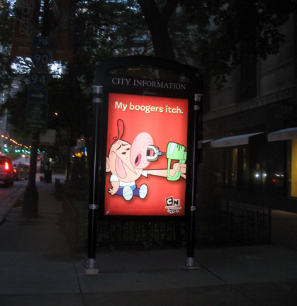
 "My Boogers Itch" may be the least likely phrase that you'd ever expect Chicago Tribune Pulitzer prize-winning architecture critic Blair Kamin to write. (But you weren't the least bit surprised to find me writing it, were you? I thought not.) Nonetheless, there it was in the lead of his fine Sunday article on city bus shelters and the latest scam to invade the city's streets - large signs engraved City Information at the top that offer up little more than another slew of billboards, including the aforementioned nasally afflicted caption for an ad for Cartoon Networks. The Tribune, being a paper of probity and reserve, declined to run a picture of the offending poster, substituting instead one featuring an artfully composed bottle on Heineken. I, on the other hand, having already established my credentials as a vulgarian, include here, for your intellectual edification, a photo of the actual billboard.
While I'd like to think that a billboard featuring a cartoon character with the blades of a blender up his nose represents a populist broadside against the high-toned pretensions of Cartier Jewelers, just a few steps away, it's more likely a product both of the way, as Kamin reports, everything is for sale in today's society (can naming rights for the mayor's shorts be far behind?), but also how, in our increasingly consolidated, globalized world, more and more decisions are based on sheer abstractions, by people - far, far away - who never come face to face with the consequences of their actions.
As Kamin reports, the city is getting $300,000,000 over 20 years for permitting the shelters to be erected. But the shelter part of the deal is merely a sideshow. The main event are the ads, because that's where the money is. The size of the ads drive the size of the shelters, and they're just too damn big. Kamin is too charitable on the actual design of the shelters, by architect Robert Stern - they're fat-boned and coffin-lidded. On the broad sidewalks of Michigan Avenue, the effect is more tolerable, but plopped down on normal-width streets like Chicago, Dearborn or Grand, the one-size-fits-all shelters (can't make the ads smaller, you know) hog the sidewalks and become a charmless obstruction to the visual flow of the street and to normal pedestrian traffic.
Another compelling read from over the weekend:
Sun-Times architecture critic Kevin Nance has an eloquent piece on Gunny Harboe's restoration of the long-lost cornice of Louis Sullivan's Carson Pirie Scott store on State Street. The blunted replacement made the building look more Corbu than Louis, but the light, flowering columns that again support the open arcade that defines the roof are the perfect complement to the rich ornament framing the shop windows at the building's base, and bring back the organic unity of Sullivan's brilliant concept. An added plus - unlike the Tribune, which still rarely runs a story's photos on the web, Nance's article includes a couple of great illustrations. (log-rolling alert: Nance also includes a gracious reference to my recent Reader article on Adler & Sullivan's Harvey House, but that's not really why I'm recommending it. I think you'll agree it's a fascinating read.)
Be sure to catch these two articles over the next few days, before they disappear into paid-archive hell.
1 comment:
Hello Lynn,
The articles you point us to are quite good. But guess who wrote about the Sullivan cornice six months ago!?
And about the city advertising more than two months ago!?
Read the July 22 entry at HelloBeautifulBlog.com
How's the car insurance?
-E
Post a Comment