click images for larger view
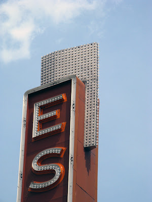
42nd ward alderman Brendan Reilly today announced a compromise that would keep parts of the original facade, including the iconic vertical sign, of the historic Art Deco Esquire Theater on Oak Street, designed by architect William Pereira and opened in 1938.The theater's auditorium was gutted in 1989 for multiplexing. It's stunning lobby spaces, as sleek as an ocean liner, were mutilated to accommodate elevators and the first floor's conversion to retail space. The theater closed for good in 2006. It was supposed to be destroyed for a ten-story boutique hotel, but then alderman Burton Natarus refused to support the upzoning, and the property was foreclosed on in November of 2009.
Now, said Reilly today in his constituent newsletter . . .
After many months of negotiation, Alderman Reilly is pleased to report that the new ownership of the Esquire Theatre site, 58 E Oak LLC, is currently pursuing an adaptive reuse of the Gold Coast parcel located at 58-68 East Oak Street. The existing Lakefront Protection Approval from September 2008 permitted a complete demolition of the Esquire Theater to be replaced with new construction of three-story boutique retail, continuing the existing character of the street. However, this new plan incorporates preservation of the existing exterior walls, the mansard roof and a complete restoration of the iconic Esquire Theater sign.Something is better than nothing, so we're told, but the result is such a total desecration of the original, the question arises of why even bother? The ribbed brick facade is cut in half, and planted with trees. The marque is gone, and the strong stone block above is reduced and punctured to a kind of mannerist frame. All sense of the original building is now lost- will the sign even be lighted? It's just a collection of artifacts. Why not just paste the sign, which is, itself, a replica, on a new building and be done with it?
‘All right,’ said the Cat; and this time it vanished quite slowly, beginning with the end of the tail, and ending with the grin, which remained some time after the rest of it had gone.


7 comments:
Maybe they should rename it the Ehhhhhhhsquire
I'll tell you why: any new construction would be worse than this collection of random stuff. The new stuff would have to conform to the area's Lagrange look, meaning beige concrete in a classical design. At least this looks fairly modern and interesting.
Boutique hotel might have been a better idea.
Boutique hotel. Why does that always seem to be the answer for "appropriate" preservation efforts? Obviously the Burnham Hotel and Hard Rock were rousing successes, but just how many boutique hotels are there? It's not as if they are just springing up left, right, and center in the city.
If preservation is to be consistently successful we need better adaptive reuse techniques than just saying "slap a boutique hotel in there."
There are several things that irk me about this design, but overall I like it. It counters the Esquire's strong, unique presence (a liability for retailers) with the ability for retailers to build their own storefronts to express their identity.
The trees are all wrong, though. They don't even make sense... the ledge they sit on is too narrow to occupy. A better "green" strategy would be to plant tall grasses to provide a visual break between the old and the new without obscuring the old entirely.
Also, I really hope the "neutral background" behind the storefronts is in the same granite as Pereira's original.
More gaping retail facade/holes to suck us in. Any sense of scale is lost at the pedestrian level, as it is with so many of these retail interventions. Chicago lets this happen too often.
Wallpaper preservation...so insulting it's better to be honest about it and tear it down completely than to make preservation a farce.
Post a Comment