 |
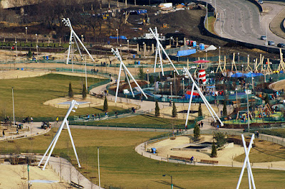
| (click images for larger view) photograph courtesy Bob Johnson |
Across the world, there have been many cases of discarded industrial infrastructure transformed into lush, green parks, but possibly never before has a new park deliberately been designed for nature to be dominated by the hardware.
These are the lightning standards of Maggie Daley Park. There are thirteen of them, and they are monsters, perversely dominating almost every vista.
In an interview with Chicago Tribune architecture critic Blair Kamin, Van Valkenburgh explained Maggie Daley's lighting design as "a concept called moon lighting; many fewer and much taller light poles. We did this at Brooklyn Bridge Park to great affect."
This is disingenuous. The lighting standards in Brooklyn Bridge Park are 35 foot-high telephone poles. Those at Maggie Daley are 50 foot-high tripods. At Brooklyn Bridge Park, many of the poles are set along the back, against an expressway that forms the parks perimeter. At Maggie Daley, the standards are omnipresent, their beady light-bulb orbs always peering over your shoulder like the eyes of a painting that follow you across the room. They march through the park like an invading band of colossi bent on conquest - over half as tall as the actual Wonder of the Ancient World Colossus of Rhodes. Looking up at the soaring, man-spreading height, the voice of Shelly may even seem to echo in your ear . . .
Look on my works, ye Mighty, and despair!
But, you may ask, won't the trees eventually overtake and tame the lighting standards? You should live so long - literally.
Van Valkenburgh told Kamin it will take a decade for the trees to double in size. After 25 years, those trees will still be only "close to mature." Van Valkenburgh's own presentation drawings show the standards rising above the mature treetops. To put this into perspective, the previous park on the site lasted less than 40 years before it had to be destroyed to repair the parking garage below. If the same calculus holds true for Maggie Daley, it means there may only be a decade and a half of relative balance between the lighting standards and the trees before the whole thing gets ripped out again.
Despite Van Valkenburgh's aesthetic pretensions, his design is actually both product of and perfect design expression of three imperatives of the relentless, increasingly toxic efficiencies of our Age of Supply Chain: consolidation, upscaling and homogenization. Instead of a traditional park's hundreds of lighting fixtures, Maggie Daley boils it down to 13. In place of the human-scale, a looming super-sizing. Instead of a pleasing variation in light and shade, a monotonous slather of uniform foot-candles, accompanied by a slick p.r. campaign: it's like the moon! The gigantic standards make Maggie Daley feel less like a park than a high school athletic field.
Having said all this, I'll be the first to admit that the standards have their own fascination. They're a visually arresting urban-techno theater, a brazen, seductive counterpoint not only to nature, but to the constructed environment of the Randolph Street and landmarked Michigan Avenue streetwalls, bent on upstaging the height of even the tallest classic skyscraper.
My bet is that, over time, Van Valkenburgh's monsters will become objects of great public affection. Far too big to ever fade into the landscape, they'll be embraced for their sheer chutzpah weirdness. That kind of eccentricity, however, will not be possible if they ever became common in placement. For that reason alone, no matter what efficiencies or cost savings they may promise, Maggie Daley Park should remain the refuge beyond which the 13 light-limbed behemoths are never allowed to roam.
Next: Mistah Burnham—He Dead - Michael Van Valkenburgh Rethinks the Chicago Lakefront Park, Part III
Previously: Strongest at the Corners - Michael Van Valkenburgh Rethinks the Chicago Lakefront Park, Part II


4 comments:
I like them
The lights go in a different visual and material direction than the log playground, so the view towards the park from the southeast, that used to be quite elegant in large part due to the trees, appears cluttered and dissonant.
The log playground is an aesthetic disaster. It has the appearance of an oversize suburban deck, constructed by a weekend woodworking hobbyist. Placing this in a such a prominent location, with the urban wall/skyline as backdrop is an extremely flawed design decision.
It's definitely an interesting choice for lighting - though hearing the explanation makes it make a little more sense. Of course, it'd be nice if they could have made the lights work with what's in the park more - it's just a little TOO jarring!
Post a Comment