 The second could be named the "silk purse" approach. A prime example would be Stanley Tigerman's witty self park on east Lake Street, but the variations are endless. At DeStefano+Partners' One South Dearborn, the cladding over the garage is lightened by a series of six-story high vertical glass louvers along Madison. Often, the ramp, itself, becomes the ornament countering the severity of the garage proper. Think of the spiral ramp at the John
  Hancock Building that provides a bravura counterpoint to the expressionless dead windows of the garage floors. At James Goettsch's 111 S. Wacker, the bottom of the ramp becomes a sculptural element in the ceiling of the lobby. At Ralph Johnson's Contemporaine, the exposed ramp becomes a stage set bit of urban theater.
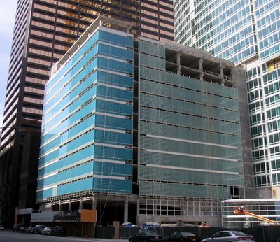
The garage for Solomon Cordwell Buenz's new condo tower, The Streeter,
 on east Grand right next to another Harry Weese classic, the former Time-Life Building, may not be the same league, but it's a graceful solution. The structure is essentially a smaller bustle to the main building, and its' clad in two different tones of glass, tending toward turquoise along Grand, and a sea green along its eastern facade. Unlike the tower, where it's an insistently expressed grid of spandrels and mullions, the curtain wall on the garage reads as continous bands of glass along each floor, each topped out by white spandrel and/or short strip of clerestory windows. It provides a bright counterpoint to the warm Cor-Ten tones of its strong-boned neighbor to the west.
3 comments:
Very interesting. Well done. I also like the tight white low spiral ramp for cars to enter the dark, tall Hancock garage (tho' I wonder about the safety today of cars entering into the first floors of a prominent high-rise.)
And we had the best parking garage ever at the LaSalle Hotel Parking Garage which Tim Samuelson tried to save on Hello Beautiful! in Oct. '04
http://www.chicagopublicradio.org/audio_library/hb_oct04.asp
It's the nation's first multi-level parking garage, designed by Holabird and Roche and built in 1918.
Here's what LPCI has on it, alas, too little to save it:
The Commission on Chicago Landmarks voted in November 2004 not to recommend landmark designation of this 87-year-old parking garage, which was one of the oldest buildings of its kind in the U.S. The city’s planning department had opposed the designation, agreeing with the owner’s contention that repair and continued use—or reuse—of the building was not economically feasible.
Older garages in other cities (i.e., Boston, Los Angeles) have been adapted or converted to other uses. LPCI had contended that the “economic hardship” argument should be a separate process from designation, as provided for in the city’s landmarks ordinance. The terra cotta-clad garage, which was designed by Holabird & Roche, was demolished July 2005 for a new condominium development.
see photos proud and sad at http://www.landmarks.org/preservation_news_going_lasalle.htm
The Montgomery's garage is a pretty decent entry, in the vein of the Hancock tower.
Post a Comment