 |
| click images for larger view |
As you move through the foyer of the Art Institute's essential exhibition
Roy Lichenstein: A Retrospective, you will see, on the walls on either side of you one of the artist's series of
Entablatures.
Just coming off his series of
Mirror paintings, Lichtenstein began a study of entablatures, in classical architecture the intermediate bands that separate the columns from the pediment. The artist looked at examples in ancient buildings he found in architectural journals, and then he took the streets around his lower Manhattan studio, taking photographs at noontime, when the high light brought out the features of the ornament in sharpest detail. The buildings he photographed were, of course, far from ancient, but contemporary, buildings that appropriated the classical idiom to link the architecture of power in ancient times to the architecture of power in modern times - the banks and financial institutions of the Wall Street district. Copies of copies of copies, much in the same way that Lichtenstein drew on existing images for his own work.
 |
| Entablature #8, 1972, 30 x 240 inches |
In the words of art historian Barbara Rose,
Entablatures are "like the comic strip in that they are reductive, symbolic and diagrammatic images closer to the world of abstract signs than to that of representational imagery.” Although each of the Entablatures are of finite size, the standardized, repetitive patterns seem infinitely extrudable, each extension like another Warhol Campbells Soup can or Brillo box.
 |
| Entablature 1975, 54 x 216 inches |
In his essay in the
excellent catalogue for the exhibition,
Two Birds With One Stone, Yve-Alain Bois relates that shortly his death, the artist was asked if he had ever produced art without an element of humor . . .
We'll I'm trying to think. Even the Entablatures are meant to be humorous in a way, because they don't seem to be funny but they mean imperial power or something like that. That's the work I can think of that's maybe the most humorless, but it's still meant to be humorous in some way.
There were 30 paintings in two series. The first, from 1971-72, were black-and-white. The second, 1974-76, in color and using textures. As Bois notes, the series could be seen to be prophetic. In 1972, Robert Venturi and Denise Scott Brown's
Learning from Las Vegas was published, and Post-Modernism in architecture, which Bois disdains, was off to the races. But the time Post-Modernism was in full flower a few years later, Lichtenstein had already moved on to somewhere else.
"This series," said Lichtenstein, "can also to seen to represent, in a humorous way, the
establishment."
Now Lichtenstein
is the establishment, entombed, for the moment, in Thomas Beeby's neo-classical Daniel F. and Ada L. Rice Building, from 1988, with its Doric-columned courtyard.
And yet Lichtenstein rebels. The amazing color of his canvases burst out of the Rice monochrome, like the vanished applied color of ancient Greek temples that classicists like Beeby always leave out of their contemporary re-imaginings.
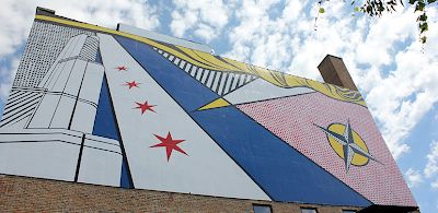
We first wrote about
Roy Lichtenstein: A Retrospective, all the way back in June, in
Lichtenstein Express, about a building-sized Lichtenstein mural created by School of the Art Institute students on the sides of a former warehouse facing the Kennedy expressway.
Tempus Fugit. We are now fast closing in on the September 3rd closing date for this remarkable show. For its final four days over the Labor Day weekend, the Art Institute is extending its hours through 8:00 p.m.
If you the only thing you thought about Lichtenstein was that he was the guy who did comic book stuff, you're in for a delightful shock. While early critics honed on his work as being all the same, what strikes you at the Art Institute is how Lichtenstein took a basic idiom, and stretched and re-invented it in multiple directions throughout his career. His final canvases included both a series of nudes . . .
 |
| Interior with Nude Leaving, 1997 |
and Japanese-inspired landscapes . . .
 |
| Landscape in Fog, 1996 |
Confronted with heroic canvasses, like Lichtenstein's take on Laocoön . . .
 |
| Laocoön, 1988 |
. . . you might be tempted to pass up the long gallery filled with mostly small things, works on paper.
Don't. Here you'll find the studies that are not only superb works of art in themselves, but testimony to Lichtenstein's craftsmanship. You can even see his penciled notes and color studies for his
Haystack and
Haystacks consideration of the same-named paintings of Monet.
 |
| The Red Horseman (Study), 1974 |
Most considerations I've read of Lichtenstein's work downplay the significance of content. Since the images are appropriated, they're seen as almost incidental, a road to the craft of the finished pieces. Yet while
how he chose to make things as an artist may be the key to Lichtenstein's importance as an artist,
what he chose to see is, at least to me, no less compelling, and the overall impression of
Roy Lichtenstein: A Retrospective is of an exceptionally capacious mind, an unsentimentally optimistic character, and a body of work that is a bracing counterpoint to the often self-absorbed fatalism of much of the art of our time.
After Chicago, the show barnstorms to the National Gallery in DC, the Tate in London, and the Pompidou in Paris. You have another 15 days to see if here. Why wait?


