click images for large view
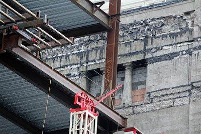
When our indefatigable correspondent Bob Johnson sent us the above photograph of the progress of VOA's stunning new 32-story. 469-feet-tall, glass walled "Vertical Campus" (naming rights still available) for Roosevelt University, we were reminded that a minor bit of history has just been rediscovered. And it's already living on borrowed time.For the last forty years, the Vertical Campus site was taken up by the late, unlamented Herman Crown Center, an infelicitous 19-story high design by Mittelbusher & Tourtelot, a firm perhaps best known locally for their work on the Krannert Art Museum at the U of I, Champaign/Urbana. The Crown Center completely covered the north wall of Adler & Sullivan's 1889 Auditorium Building.
Over eight decades earlier, however, on Bastille Day, 1887, developer William Giles entered into an agreement with the fledgling Chicago Auditorium Association working out the details for the party wall that his 1875 Giles Building, a six-story, mansard-roofed structure designed by architect Otis L. Wheelock, would soon be sharing with the Association's massive new, Adler & Sullivan designed home.
With the Crown Center demolished, we're now able to see - for a brief period of time - a bit of architectural archeology. The Auditorium's north wall is now exposed. Most of it, that part butting up against the Giles, is alley brick. At the top however, above what was then the roofline of the Giles, a section of the Auditorium's north wall has a full finish, topped by a mini-loggia which mirrored that of the Auditorium tower, from which Adler, Sullivan, and Frank Lloyd Wright in their offices could look down - probably on multiple levels - on the Giles.
Soon this facing will again disappear, this time behind the new VOA Vertical Campus, which has its own, pre-made party wall. While the renderings of the new structure almost all emphasize the shimmering glass walls on three of its elevations . . .
. . . the northern elevation is quite different, and far more utilitarian, with what appears to be a shear, blank concrete wall rising for half the structure's height.
Obviously, this is anticipating future development to the north, on what is now a surface parking lot. Let's hope that the economy revs up fast enough so that we won't have to be staring at that towering mass of bare concrete for the next few decades.
I won't claim it merits a special trip, but if you happen to be in vicinity of Wabash and Van Buren, it might be worth looking up to grab a time travel glance at a Adler & Sullivan remnant that's again about to vanish into the steel and glass mists.


4 comments:
Are you sure it's going to be covered? If you look at the renderings (some not pictured in your post) it looks like the portion of the tower adjacent to the Auditorium rises to only about 6 floors and then there is a setback. It might be harder to see in the future but it still may be visible.
Will be completely covered? No. Will it be effectively unviewable at that angle? I'm betting so. The interesting thing is whether the current decrepit state of that mini-Loggia will be left as it is for the few people in the new tower who will be able see it from the the windows directly across.
While I find it worthwhile to note the "decrepit state" of the mini-loggia (lowercased, as it bears no relation, nor resemblance to the great Robert Loggia) do we even know what kind of classroom or office use currently sits behind that wall?
Opening it up may well provide a grand window to let the sun shine into what is now a "decrepit" men's room.
never proposed opening it up - although it would be nice, should it actually be a usable space behind it. would suggest that if it remains visible from the new building, might be a nice idea to at least clean it up - even it can't be reglazed - so it looks a bit better than the current flaking architectural dandruff.
Post a Comment