When
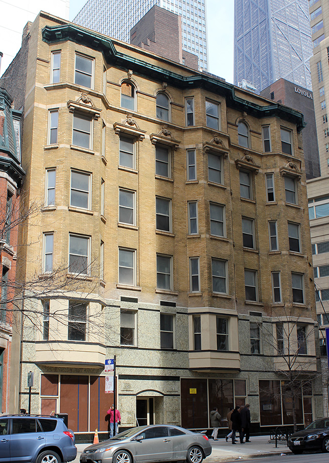
last we visited Pond and Pond's Amanda Apartments at 55-60 East Chicago, the bottom two floors were covered in plastic for a rehab.
click images for larger view
Now the wraps are off. Avert your eyes.
Yes, as dedicated reader BW Chicago has noted, I actually used the phrase, "The drawings point to a definite improvement." And no, I don't remember what I was high on that day. I guess the drawings looked clean.
What was immediately apparent, even from the drawings, is that the plan was to trash Pond and Pond's original design, with its charming monumental entrance and rounded pediments above three second-story windows reflecting parallel features above the windows of the penultimate floor.

What was not so completely apparent is how God-awful the entire installation would be It, in fact, varies substantially from the drawing posted on the site. On the plus side, much of the clumsy detailing was left unrealized. On the down side, where the drawing shows rounded pediments above the second story windows, what we actually get is a series of blocky, ugly black rectangles. A thin, dark string course simply breaks off and disappears above the windows, where I guess the chunky rectangles above are supposed to take its place. Strangely enough, the entrance is also slightly different, with a small arched accent added above it. If it was an attempt to reference Pond and Pond's pediments above, it's pathetic. The new facing is the color and visual consistency of green vomit.
No doubt the landlord is overjoyed.