A daily blog on architecture in Chicago, and other topics cultural, political and mineral.
Click on the COMMENTS link under each post to join the discussion.
Monday, May 06, 2013
Lipstick Glowing on the Off Ramp: Congress Parkway's New Lighting
click images for larger view
Can you really redeem something created in the urban equivalent of original sin, when even the two parts of its name - ‘Congress’ and ‘Parkway’ - form an oxymoron?
In 1909, for his Plan of Chicago, Daniel Burnham envisioned Congress Parkway as the city's great civic promenade, a tree-lined boulevard lined with uniform-height
Beaux Arts Buildings leading to a great new public square at Halsted Street dominated by a massive domed City Hall.
Even as Burnham was writing his Plan, however, a new city hall was already under construction at the site of its predecessor, over a mile away. In 1932, the vista west down Congress was terminated, not with a classically styled civic building, but by Graham, Anderson, Probst and White's humongous Main Post Office, fitted out in stripped-down Art Deco style. In the 1950's, the site where Burnham envisioned his great domed structure became, instead, the ‘Spaghetti Bowl’, a sprawling, anti-urban interchange of ramps linking the three great expressways - north, south, and west - that quickly began sucking the middle class out of the center city.
Image courtesy The Chuckman Collection
The grand boulevard envisioned by Burnham became, instead, the
Congress Expressway, emerging under the Post Office to transform Congress Parkway into a high-speed connector to Michigan Avenue, favoring not the flaneur but the foot-to-the-floor crowd.
The life of the street was snuffed out as buildings had their end bays
sheared off and smaller structures were simply demolished to widen the roadway. In one of great acts of civic self-mutilation, new sidewalks were hacked out of the buildings facing the street. resulting in the destruction of Louis Sullivan's renowned Oak Bar in the
Auditorium, a posthumous connection between the architect and Mies van
der Rohe, who liked to drink there.
Over time, Congress Parkway became the butt-end, back office roadway of the south edge of the Loop. Westward towards Wells, there were no restaurants, no shops, just big, blank-faced buildings. In 1975 came Harry Weese's Metropolitan Correctional Center, and its massive garage. Along Clark Street, it's spiky and open; along Congress it's a segmented shear wall.
In 1985, we got Lucien Lagrange's One Financial Place. Along Wells Street, it offers a lovely public plaza centered by Ludovico di Luigi's equestrian sculpture. At Congress Street, it spews forward a South Wing building constructed over the roadway. It's like a blinded ogre, two massive arched windows providing a false promise of transparency within a hulking Chinese wall, clad in Imperial Red granite.
More recently, Congress Parkway east from State has evolved in street-life friendly ways, with the addition of the Harold L. Washington Library in 1991, the street-level shops of University Center in 2004 and Library Tower in 2006. To the west, Congress Parkway stubbornly remains more of a service road than a real street, with blank-faced buildings exemplified by the bunkered
AT&T facility at 55 West and the Western Union building across the
street. There's also the Loop's last surviving gas station. Seven lanes of traffic rushes by, motorists gunning it at speeds sometimes approaching 60 miles an hour.
Renderings: Chicago Department of Transportation
So, it's only natural that the city would want to try to find a way to make it all a little less awful. The Chicago Department of Transportation had been working on the problem since at least 2005, and in 2010 they announced plans to make Congress Parkway, from Wells to Michigan, less of what the Trib's Blair Kamin labeled as a ‘drag strip’ and more of the civic gateway Daniel Burnham had envisioned.
Rendering: Chicago Department of Transportation
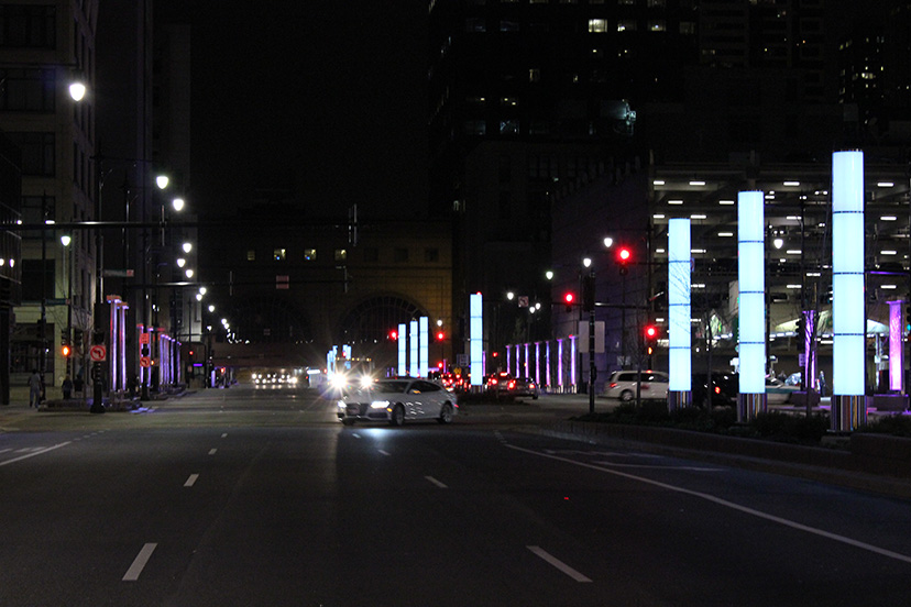
Eighteen 20-foot-high pillars of light, coupled with a procession of illuminated decorative metal trellises, would offset the drabness of Congress Parkway's buildings and allow the thoroughfare to ‘dance’ with the color-lit plumes of Buckingham Fountain in the distance. The 600 LED lights are programmable to be able to change hue to any one of 16 million colors, although CDOT says the program will probably have just four basic variations across the year. One lane of traffic was lopped off to allow for wider sidewalks west of State and five new median islands were created both to create room for the pillars, and to provide pedestrians a resting place midway through their crossing of the ultra-wide thoroughfare, which was realigned to eliminate ‘weaving’ lanes and slow down the rush of the up to 63,000 vehicles that travel the route each day.
All of this didn't come cheap. The final cost is $24 million. Financing included $11.8 million in South
Loop TIF funds, and another $9 million in Federal stimulus money. Mayor Rahm Emanuel, CDOT Commissioner Gabe Klein, and U.S. Senator Richard Durbin came together to take off the wraps this past April 12th. What did we get for the money?
I'm generally a sucker for colored lights (and balls of string), but my reaction to the new Congress Parkway installation is pretty much the same as when I encountered Lightscape on State. It's numbingly generic and devoid of any personality.
To call these blocky sheets of metal ‘trellises’ is really stretching the term. A trellis, by definition, is light and open. Those on Congress are incised sheets of metals in thick frames. The way the sheets become more open - more trellis-like - as they rise is largely negated by being weighed down at the top by heavy caps that house the lighting elements. I may be wrong, but all of the metal screens appear to be identical. Never really breaking free from the straitjacket of their frames, they march the street with less a sense of progression than monotony.
Yes, there are there those five new median islands, but when they're described as “pedestrian refuges areas”, it pretty much tells you which mode of traffic is actually controlling the design, and it's not those on foot. Yes, the ‘refuges’ are large, but the small amount of sidewalk is overwhelmed by huge ventilation grates and landscaping raised and sequestered behind granite retainers that visually express ‘pedestrians keep out’ in no uncertain terms. There must have been a sale on rough-cut granite, because not only is it used to wall up most of the islands from human habitation, but the ‘street furniture’ consists solely of big chunks of rough cut stone bisected on top with graceless strips of metal to make sure no one tries to sleep on them.
During the day, the pillars and metal trellises look a bit like unplugged appliances sitting on a kitchen counter. They really need the kindness of night to come into their own. Ironically, the new lighting works best where it's least needed, at the point where the street narrows at State Street. Here the buildings have large lit window spaces and a variation of illuminated signage to play off of, and the trellises become an interesting addition to the overall fabric.
In the real problem area, however, approaching LaSalle, the installation is unable to dispel the overweening gloom of the aggressively featureless architecture. It works best where the space it inhabits is most tightly confined - the underpass beneath the South Wing at LaSalle, where the lighting runs
along the walls for their entire length, creating an intense visual
focus as they change in hue.
Along the parkway, itself, the colorful light from the the pillars seems almost to evaporate into the darkness above, like smoke floating up a chimney from flames in a fireplace.
From my perspective as a pedestrian, I really don't think the whole processional thing works all that well. It all seems engineered for the pace not of walking, but of driving. Speeding along in a car, the succession of lighted pillars at regular intervals may actually suggest the kind of grand gateway the design intends. But as I watched the stream of cars speeding by me - even after all the efforts to slow it down - I couldn't help asking myself the question: why so much money and effort to impress motorists whose primary focus isn't enjoying the parkway but getting beyond it as fast as they can?
When (if) the now small, scrawny trees mature, they may provide a better balance, dominating the day as the LED fixtures dominate the night. As it is, I can't help thinking that a much better gateway would have been created simply by putting in a lot more, much larger, more mature trees, and designing a lighting scheme to illuminate the lush softness of nature against the hard austerity of the buildings. In the last analysis, the GSA's retrofit of 101 West Congress,
which gave a more open face to the 1912 Holabird and Roche building
where Rand McNally once printed their guides and manufactured their
globes, has probably done more for making Congress Parkway attractive than the entire six-block lighting installation. note: ants were sharing a warm spring night with me just off of Congress Parkway
This was a problem that would really have benefited from a competition drawing on the creativity of Chicago's best architects and lighting designers. Will we ever get the City of Chicago and those who run the competitions into a beneficial relationship? (How the city responds - or doesn't - to the Chicago Architectural Club's 2013 Burnham Prize Competition, Next Stop: Designing Chicago BRT Stations may give us a better idea of whether we're making any progress.)
I don't want to be harsh. The new design looks better at night, and better still in photographs, as opposed to in actual experience. I wish I liked it more, and it's possible it will grow on me. I know mine is a minority view. No doubt somewhere the awards certificates are already being printed. I applaud the shear guts of taking on this challenging task. I just wish CDOT had challenged themselves a bit more. The very real problem of Congress Parkway has been addressed less by solving it than by kicking it down the road.
An excellent article on a tough subject. Yes, I too want to like what was done, but the worst part is the building-edge conditions that still exist, e.g. the south facade of the Manhattan Building, it is deplorable and has been for some forty years! This is all a good start, but only that as much still must be done.
after some unpleasant gastro problem, Jack
said...
you are being too kind, Lynn..
Compare this to the sublime lighting recently installed along the midway at UofC... everything about the Congress design is amateur hour: from the mind-numbing monotony of the tomb-like "trellises" to the horrific detailing of the bases of the "pillars"(reminds me of highway light standard 1970's with the poles levitating above exposed bolts), to the lack of any thought given to their actual placement (has anyone noticed the variation in height and alignment? clearly no thought was given to either trying to align them or to any meaningful thought to how they vary), to the ridiculously over designed planter surrounds with varying heights of granite, fussy stainless rails (in 'prairie' style I suppose), to the use of both real and fake(!) (precast) rusticated granite, to precast planter boxes destined to hold nothing but trash...
a fortune was spent on all that stainless and the result is an embarrassment for Chicago... looks like something maybe a city like Omaha would might be proud of...
When we lived in LA, they added clusters of the same looking lighted tubes to the grand, relandscaped entrance to LAX. They're much larger, and make more of a statement. Chicago's tubular version seems all out of whack. The entire redo feels like it's missed the mark. Lots of money spent for a very visually sloppy result.
I agree with Jack. U of C did a first rate job with their pedestrian crossings of the Midway. This work on Congress is an "almost" at best.
I sometimes need to walk along Congress at night to access LaSalle St. station. The lighting at the underpass is very welcome. The addition of color to the streetscape makes it less bleak at night. The "trellises" would have been better if they didn't look so computer designed and used at least 3-4 different designs instead of being identical.
I'd love to see trompe l'oeil murals on the stark building facades that make Congress so bleak. Something like the one at LaSalle and Division would be lovely.
The lighting design is very generic and banal. It is a huge missed opportunity. The U of C did a much better job on the Midway. I hope this is not indicative of the direction urban design is going under the Emanual administration. There is very little to show for $24 million.


7 comments:
An excellent article on a tough subject. Yes, I too want to like what was done, but the worst part is the building-edge conditions that still exist, e.g. the south facade of the Manhattan Building, it is deplorable and has been for some forty years! This is all a good start, but only that as much still must be done.
you are being too kind, Lynn..
Compare this to the sublime lighting recently installed along the midway at UofC... everything about the Congress design is amateur hour: from the mind-numbing monotony of the tomb-like "trellises" to the horrific detailing of the bases of the "pillars"(reminds me of highway light standard 1970's with the poles levitating above exposed bolts), to the lack of any thought given to their actual placement (has anyone noticed the variation in height and alignment? clearly no thought was given to either trying to align them or to any meaningful thought to how they vary), to the ridiculously over designed planter surrounds with varying heights of granite, fussy stainless rails (in 'prairie' style I suppose), to the use of both real and fake(!) (precast) rusticated granite, to precast planter boxes destined to hold nothing but trash...
a fortune was spent on all that stainless and the result is an embarrassment for Chicago... looks like something maybe a city like Omaha would might be proud of...
I agree with everything in this article and appreciate the additional research and perspective included.
When we lived in LA, they added clusters of the same looking lighted tubes to the grand, relandscaped entrance to LAX.
They're much larger, and make more of a statement.
Chicago's tubular version seems all out of whack.
The entire redo feels like it's missed the mark.
Lots of money spent for a very visually sloppy result.
Here's a video on the LA light. (They turn colors, as well)http://www.youtube.com/watch?v=9dOMP_g1V2s
I agree with Jack. U of C did a first rate job with their pedestrian crossings of the Midway. This work on Congress is an "almost" at best.
I sometimes need to walk along Congress at night to access LaSalle St. station. The lighting at the underpass is very welcome. The addition of color to the streetscape makes it less bleak at night. The "trellises" would have been better if they didn't look so computer designed and used at least 3-4 different designs instead of being identical.
I'd love to see trompe l'oeil murals on the stark building facades that make Congress so bleak. Something like the one at LaSalle and Division would be lovely.
The lighting design is very generic and banal. It is a huge missed opportunity. The U of C did a much better job on the Midway. I hope this is not indicative of the direction urban design is going under the Emanual administration. There is very little to show for $24 million.
Post a Comment