
click images for larger view
It's always difficult to imagine the architecture of the past as it actually appeared to people in its time. When it comes to the Chicago of the late 19th century, that past, now mostly wiped from the cityscape, passes through the desaturating black-and-white photographic record. Later photos may be more plentiful, but they usually depict buildings substantially altered from their original design.
But Louis Sullivan won't let you get away with it. The beautiful simplicity of his Carson Pirie Scott store is anchored by an entrance floor marked by huge shop windows enveloped by the rich, foliate ornament for which Sullivan was famous. His interiors, especially, were anything but austere, rich with stenciling, often designed with collaborators Louis J. Millet and George Healy, some of which, in a not uncontroversial restoration, was on display at a Crown Hall exhibition at few years back.
Adler and Sullivan's 1891 Schiller/Garrick Theater is a case in point. Not only was the building itself tragically demolished in 1961, it's original interior design was painted over just seven years after the theater's opening.
As part of the new exhibition Wright's Roots, at the Expo 72 Gallery at 72 East Randolph through September 30th, 2012. curator and Chicago Cultural Historian Tim Samuelson endeavored to reveal, for the first time in over a century, the original color scheme of the ornament above the balcony, on the underside of the gallery.
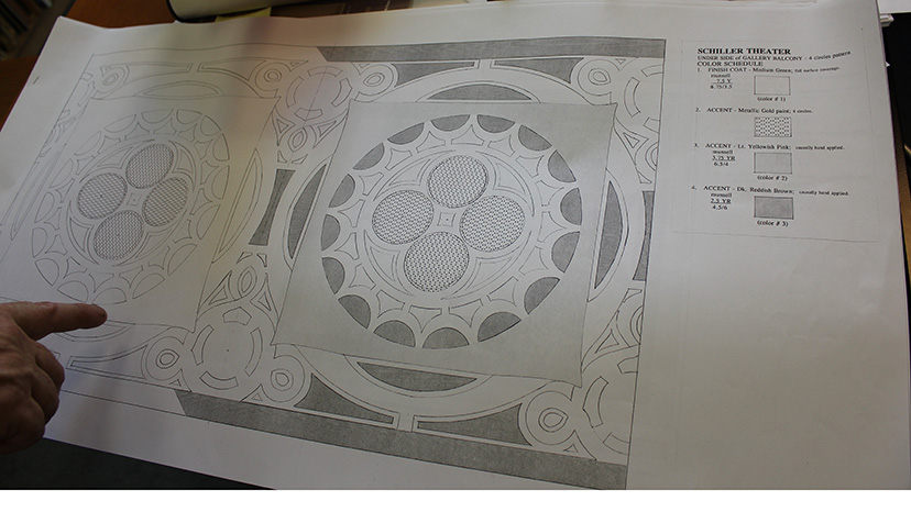

The walls on which Wright's Roots is mounted are painted in the colors of that palette.

A substantial part of Wright's Roots traces the early, formative years when young Frank Lloyd Wright worked under the direction of Louis Sullivan, the man for whom he never lost his deep admiration and affection. Wright's hand can still be seen in many of Adler and Sullivan's buildings of that period, and Samuelson painstakingly lays out key examples.

When shown a photograph of the this long-forgotten project by architectural historian Richard Nickel in 1957, the ninety-year-old Frank grew momentarily quiet and then said, "So . . . you found THAT one, did you?" After another pause, he said the design was his.Another piece of ornament that didn't make it into Wright's Roots documents the different route Frank Lloyd Wright would take from that of his mentor Louis Sullivan.


There are a lot more fascinating stories in Wright's Roots, which we hope to write about in more detail (famous last words) soon. Needless to say, it's a don't-miss event. See it, and let your own imagination run free.
No comments:
Post a Comment